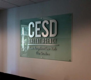
Office Signs
The Leader in Office Signs in Los Angeles
Looking to have an office sign custom made for your office in the Los Angeles area? Make no mistake that businesses who have office signs in their receptionist area are perceived as offering better products and services. It may seem superficial to dwell on first impressions and office signage, the perception of visitors and employees is more malleable than you think.
(click here to see gallery)
But you can’t just hang a banner with your logo printed on it behind the receptionist’s desk and call it quits. You need to have every aspect of your office signage – sizing, design, materials, and more – working together to produce an overall effect that’ll stay in-line with your business’s branding.
If you’re in the market for successful office signage, you’ve come to right place. Keep reading to discover what principles make for effective office signs and dimensional logos.
We Specialize in Custom Office Wall Signs
Your logo or branding showcased front and center, but how much influence can a sign have if it’s too large to be read (at least, without walking back twenty feet)? Likewise, a sign that is too small will fail to impress, or even worse, fail to be noticed.
Measure the dimensions of the wall on which you plan to display your office sign. As a rule, you’ll want to keep the width of the sign close to half the width of the wall itself. There are exceptions to this, however; when go out to the site and take measurement and pictures then we can determine the exact size that the sign or logo needs to be once we input all the measurement of the wall into the computer. We will then make a rendition of the sign on the wall, so the customer can view it for approval.
And, perhaps this should go without saying, but do not block your office sign! Your signage should be high enough that a person cannot obstruct your design by sitting in front of it.
Do I order standalone letters or a logo board?
For those inclined toward a minimalist approach, dimensional lettering provides a complimentary accent to the wall behind it. A digitally imprinted board will feature a greater variety of sizing and can be used for smaller wall spaces accordingly.
Illuminated signage is possible for both styles – dimensional lettering must remain backlit by design, whereas a logo board has several options for lighting.
Choose the Materials For Your Sign
Most signs have to endure the harshness and unpredictability of inclement weather, vandalism, and ultraviolet light. Not so with indoor office signs. As such, few limitations or downsides will dissuade a company from using one material over the other.
Materials for reception areas signs include stainless steel, aluminum, brass, bronze, copper, acrylic, while all can be fabricated within a reasonable time frame.
Ultimately, the material choice comes down to the brand’s aesthetic. A lawyer’s practice may be better off with classic, metal dimensional lettering, while an architect’s firm may benefit from off-the-wall with backlit aluminum letters.
For more information on office signs contact us 818-861-5394 or info@losangelessigns.biz


